New Neutrals in Tile Colors You’ll Love
Home decorating trends come and go. You’re introduced to each season’s “latest colors” and then watch as those trendy colors fade away. Is there a way to avoid this cycle? There is, and the key lies with using neutral tile colors. You can avoid outdated color schemes that call for updates by choosing neutral tile colors. Read on to find out how beige is coming back with some great mixtures of new neutrals in tile colors.
Why Neutral Tile Colors Are Always the Trend
There are plenty of tried-and-true tile color combinations that include neutrals. Neutrals coordinate beautifully with a diverse array of bold colors. And they keep the overall ambiance of a remodeling project perfectly balanced. As such, neutral tile colors hold the key to timeless design. When you think of neutral colors, beige might come to mind. Beige is a versatile, calming color that carries much historical elegance. It’s neither too dark nor too light, and it can work well with rooms of any color, motif, and decor.

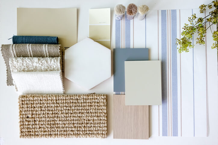
Sometimes it’s hard to envision how certain colors will work within your space. Our recommendation is to bring in other materials or paint samples that help you see how it works with different tile colors. There are a lot of different variations of neutral colors, so it helps to see what works best in your space.
Beige has traditionally been one of the most popular and useful neutral colors for interior design. But many others are just as subtle and powerful. Some of the most versatile neutral colors that are both trending and timeless include:
- Charcoal
- Black
- Taupe
- Navy
- White
- Wheat
- Mauve
- Putty
- Ivory
- Shades of gray
- Brown shades
- Pale greens
Choosing the ideal combination of colors and neutrals for your next remodel might feel like an impossible task. However, time-tested tile color combinations will make a perfect statement with trendy neutrals – and will stay that way.
The Best Neutral Tile Colors and Combinations
There is no end to the combinations and striking designs you can create. Try these neutral tile colors paired with various gorgeous hues.
Taupe and Deep Green
You can pair a deep green hue with a natural earth tone like taupe. This combination evokes the beauty of the outdoors in a timeless coupling that pays homage to organic design. When you accent taupe with dark, dimensional greens, the dark and light shades blossom in perfect balance.
Black and White
Using white to offset black has intense effects. For example, when you use white for large elements in a room and black as an accent color, the room appears larger. Alternatively, black can predominate while white appears in smaller details. This can make the design seem warmer.
Navy and Wood
Navy is a neutral that can provide an elegant, sleek appearance in any application. This makes it one of the most versatile and stunning neutrals ever. Pairing navy with wood produces a look as refreshing as it is everlasting.
Charcoal and Mint
What better neutral tile color to offset pastel mint’s soft, airy look than an equally bold charcoal gray? This combination presents a blend of chic nostalgia and creamy delicacy. In addition, neutral charcoal provides a beautiful contradiction to mint in otherwise simple designs.
Wheat and Yellow
Wheat is a shade of brown as versatile as black but not nearly as predictable. It can be luxurious and grounding, especially when paired with yellow. When you combine wheat with yellow accents, it emits a sophisticated and polarized aura. This aura isn’t diminished in any way when you choose yellow with wheat accents.
The New Neutral Tile Colors
New neutral tile colors are classic shades that stand their ground on their own. And they make strong statements when paired with the right colors. Are you looking for new neutral tile colors for your next project? Browse our online inventory or visit our showroom at Atlas Marble & Tile. Contact us any time to let us know how we can help you.
Share