6 Popular Tile Colors & How They Can Change Your Mood
Have you ever walked into a room and quickly noticed a shift in your mood? Were you overcome with a sense of calm and relaxation? Did you feel joyful and energized? Or, were you suddenly stressed out and overwhelmed? Interestingly, your specific emotions may have something to do with the room’s color, including tile floor and wall colors. In fact, colors are scientifically proven to have psychological impacts on our mood, behaviors, and stress levels. Of course, it’s not an exact science. But, generally speaking, people tend to have similar reactions to colors. Therefore, it’s essential to take your time when selecting tile colors so you can get precisely what you want from the rooms in your home. Here are some popular tile colors and the familiar feelings they evoke to help you along in the process.
1. Blue – Stability & Tranquility
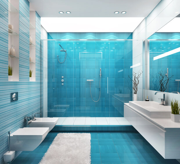
Create a calm, serene setting with a blue tile master bathroom.
The color blue represents tranquility, serenity, trust, wisdom, and peace. It’s also the most stable color, thus creating a calm and comfortable setting. It is also the perfect color to invoke that ‘beachie’ feel. Therefore, blue is an outstanding tile color for bathrooms, bedrooms, living rooms, or even a home office. Blue colors can also help maintain concentration, lower the heart rate, and boost productivity. Blues and blue-greys can be a wonderful addition for your backsplash and should be considered for your laundry room.
2. White – Simplicity & Serenity
White colors typically convey cleanliness, purity, freshness, and simplicity. When used in the home, white tile walls and flooring can make rooms seem more prominent and spacious. Not to mention, the bright color can even symbolize a fresh start. However, an abundance of white in a large room can come off as bland and sterile. So, it’s important to counter the monochromatic colorway with a pop of color. Consider your vanity, counter top, or accessories to get that contrast. Needless to say, when used appropriately, white tile is an elegant, practical choice for modern kitchens, bathrooms, laundry rooms, and more.
3. Yellow, Orange & Gold – Energy & Warmth
Yellow, orange and gold colors create feelings of happiness, creativity, success, and determination. Research has found that these colors increase oxygen supply to the brain, produces an energizing effect, and stimulates brain activity. In the home, orange is the perfect color for a room that needs a burst of enthusiasm and energy. While yellow evokes sunshine and gold has made a resurgence in modern design.
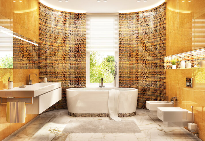
Go for a warm, sophisticated look with an intricate orange tile bathroom.
Keep in mind that brighter shades of tiles are best for smaller, minimal applications, such as kitchen backsplash tiles. Combine bright oranges with yellow and red to create an energetic atmosphere. On the other hand, light or muted orange, yellow or gold are easier on the eyes, so more tile can be used in this case. Or, try adding dark grays and browns to light oranges for a warmer, sophisticated effect. Also, Schluter is now offering new gold tones to their profiles to incorporate as edging and drain covers.
4. Turquoise & Green – Healing & Harmony
The colors turquoise and green symbolize nature, harmony, happiness, and emotional safety. They are also very restful colors for the eyes. And, because of the association with tranquility and healing, turquoise and green tiles are excellent choices for nearly any room in your home (e.g., living room, bedroom, bathroom, etc.) To make your bathroom feel like a relaxing spa, try different green shades in a mosaic tile backsplash.
5. Red – Vibrancy & Passion
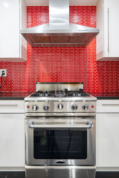
Create a dramatic, eye-catching effect with a bright red tile backsplash in the kitchen.
Red is a compelling color that symbolizes intense emotions, such as passion, drama, excitement, vibrancy, and even hunger. When used in the home, red colors are best suited for the kitchen and dining room (based on its ability to stimulate our metabolism and heart rate). In particular, red tile can also create a dramatic look, such as dark red subway backsplash tile. Dark reds, such as maroon, may also evoke emotions such as courage and leadership.
On the other hand, to tone down the bold look, you can always combine red tile with magentas or muted grays. For a more natural feel, pair rustic red tile with earth tones, such as brown, blue, and green. Red goes well with any color metal, so it will be fun to coordinate your hardware with red tones.
6. Purple – Luxury & Creativity
The color purple creates a feeling of royalty, creativity, and luxury. Dark shades of purple are dramatic and evoke sophistication. In contrast, lighter shades of purples are soothing, which works well to create a relaxing environment. When it comes to tile, light purple tile pairs well with aqua blue to create gentle energy in bedrooms and bathrooms. Conversely, for a more lively, energetic feel, mid-tone purple tile and mustard yellow makes a beautiful kitchen backsplash. Or, you can pair dark purple tile with black or silver colors for a lavish, regal feel.
Still not sure what tile color best suits your room? Check out our showroom at Atlas Marble and Tile in Arnold, Maryland. Or, see our blog for more inspiration. Let us help you choose the best tile for your home today.
Share